Monday, April 27, 2015

Limited Palette Butterfly


Except for the blue, I used the same palette as before. Used a lighter, warmer, "sky blue" this time.

 Finally got it posted because I'm home today sick (flu or really bad cold not sure which).

Wednesday, April 1, 2015

Limited palette Dragonfly

There's a challenge to do a limited palette pastel painting 1 yellow, 1 red, 1 blue, 1 Earth color, and black/white if needed.  Here's my palette: (didn't use the purple in the kit)
 And here's the painting I created with it:

 It's so different trying to mix dry pigments directly on the paper instead of liquid colors in a tray to get it "just right" before applying it to paper. Because of that, my dragon fly is not a neon turquoise like the photo shows. This probably isn't the best challenge for me, a beginner, but I wanted to try it anyway.

Here's the original: http://paintmyphoto.ning.com/photo/dragon-fly-2-2

There's a few more photos I want to try limited palette with but not tonight.

Sunday, March 29, 2015

Strawberry cream on black


Painted 9"x12" black construction paper that I used 150 grit sandpaper on to rough up the surface because I didn't think the regular paper would accept pastel well. Black is an interesting color to work on...you can still see it through the ice cream (but I figured it would show through) and it really made my colors POP more than I thought (I've mainly worked on white or cream papers before, so that's why I wanted a cheap way to try colored papers). Except for the pink not being as solid looking as I'd like, I'm actually pleased with it because for my skill level, it's good. :) I haven't sprayed a fixitive on it yet so I don't know if I could get the pink "more solid" by doing that or not.  I think I need more  peach.

Monday, March 16, 2015

Two Horses Pastel painting

Horses are my favorite subject (I have to settle for painting since I can't afford to own one) and I took the challenge to create a painting in a long style (could be a web page banner). It measures 8"x12" and is done in pastel on a light gray charcoal paper.  I put the following two photos together:  http://paintmyphoto.ning.com/photo/white-horse-3-2 & http://paintmyphoto.ning.com/photo/white-horse-1-1


The tree's leaves don't look that bright to my eye as it is showing up in the camera's eye.  Otherwise, I'd say that's a fairly accurate color representation. The horses almost seem to glow/look like they weren't painted, but I did use light gray and white to paint them so they are painted.  LOL   For some reason, I got it into my head to put a ragged border to look like torn paper and I like how it turned out (even if I didn't like removing all the bits of tape from the paper so it's not something I think I'll do often).   


Friday, March 13, 2015

Four new pastel paintings

Each one is 5"x7"


Monday, February 16, 2015

Neglected blog revived with art work

Oil pastel caricature of me 
 
 Pastel painting of tree with beautiful sunset for a challenge in the Pastel group on Paint My Photo Ning website. 2-16-15

 
Pastel painting of glass and flowers for Glass challenge in the pastel group on PMP.
2-16-15


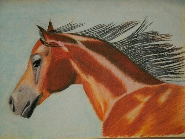
 Horse in oil pastel for Heart of the Horse group on PMP. 2-1-15
 Pastel Horse for Heart of the Horse group challenge on PMP. 1-31-15
*
*
*
 3 point perspective that turned into 4 point (November 2014)
 Horse in Charcoal (November 2014)
 Pears in pencil
Trees in oil (Bob Ross style)

 butterfly in clay       December 2014
 Pastel painting following along with PaintBasket (want to do more when I can afford more)  
January 2015

Pastel practice
January 2015


Tuesday, August 27, 2013

Tuesday, August 20, 2013